KILL me NOW!!!.... times ticking and i'm still trying to figure out my portfolio final edits. This week i decided to cancel any further photo shoots i had in mind (i had about five people lined up!). I have a good body of portraits to work with, so now its just a matter of what's going to go up and whats not.
After going to the wall and seeing the possibilities, I've been milling over whether i want to present six photos or more. Money is the main player in this game so i have to be very considered as to what i want to do. The last thing i want is to produce work that looks and feels unfinished or lacking in something. I remember seeing the work from last semester and being really inspired to produce a solid body of work. At the end of the day, i want to be proud of the work i do and i want people to see the effort that I've gone through to present it. It's not just a tribute to me but to all those who have participated in this project with me.
Below are my experiments regarding my final presentation:
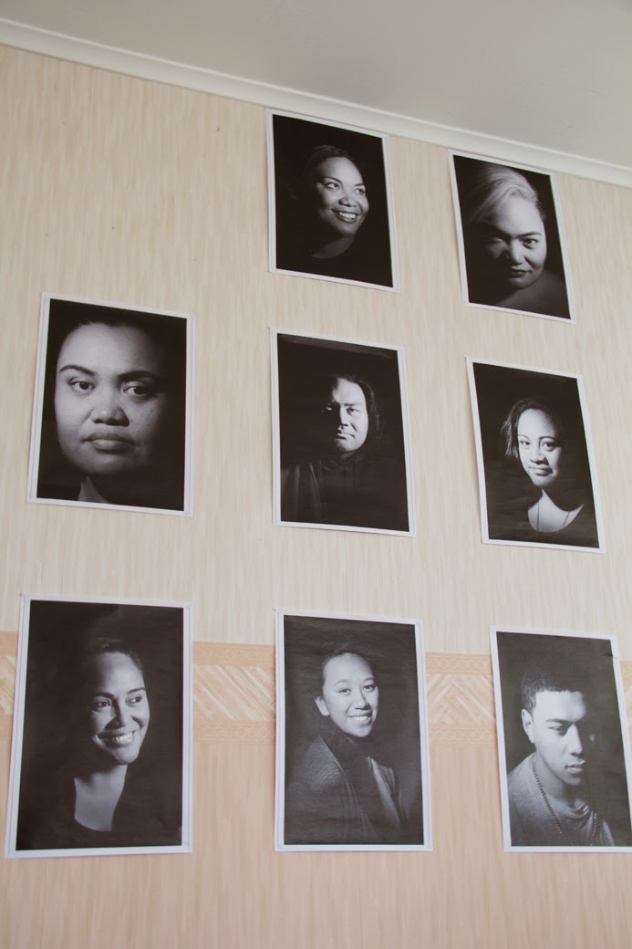
The wall i'm using is 255cm x 234 cm - This is an arrangement of 10 portraits
 I edited two photos because Tua's photo was too large (bottom left) in comparison to the rest of the group. The second photo of Taga's, in comparison to the rest of the group, her photo didn't quite fit (second row, right).
 I bought back Tua into the second row. Her and Montel sit well side by side and Montel sits well by Fou. The grouping still doesn't seem right though. There are some photos which work well together because of lighting or because they balance out each other, but as a whole it doesn't seem to work.

Just playing around with the order again!! hehehe I feel Tua's photo seems to over power the others and Chris looks tiny beside her. I'm really liking Fou's photo, its reminiscent of the Mona Lisa.
 I think i like this alot. Had a good debate with the family about the different layouts and photos. I found that i had pretty much chosen the images i wanted to present. My justifications were that although they were all individually strong photos on their own, as a group they exist to support one another. In this formation, i feel that no one image takes over the other. The outer images cradle the images in the centre.
After going to the wall and seeing the possibilities, I've been milling over whether i want to present six photos or more. Money is the main player in this game so i have to be very considered as to what i want to do. The last thing i want is to produce work that looks and feels unfinished or lacking in something. I remember seeing the work from last semester and being really inspired to produce a solid body of work. At the end of the day, i want to be proud of the work i do and i want people to see the effort that I've gone through to present it. It's not just a tribute to me but to all those who have participated in this project with me.
Below are my experiments regarding my final presentation:
The wall i'm using is 255cm x 234 cm - This is an arrangement of 10 portraits
Just playing around with the order again!! hehehe I feel Tua's photo seems to over power the others and Chris looks tiny beside her. I'm really liking Fou's photo, its reminiscent of the Mona Lisa.
Comments
Post a Comment